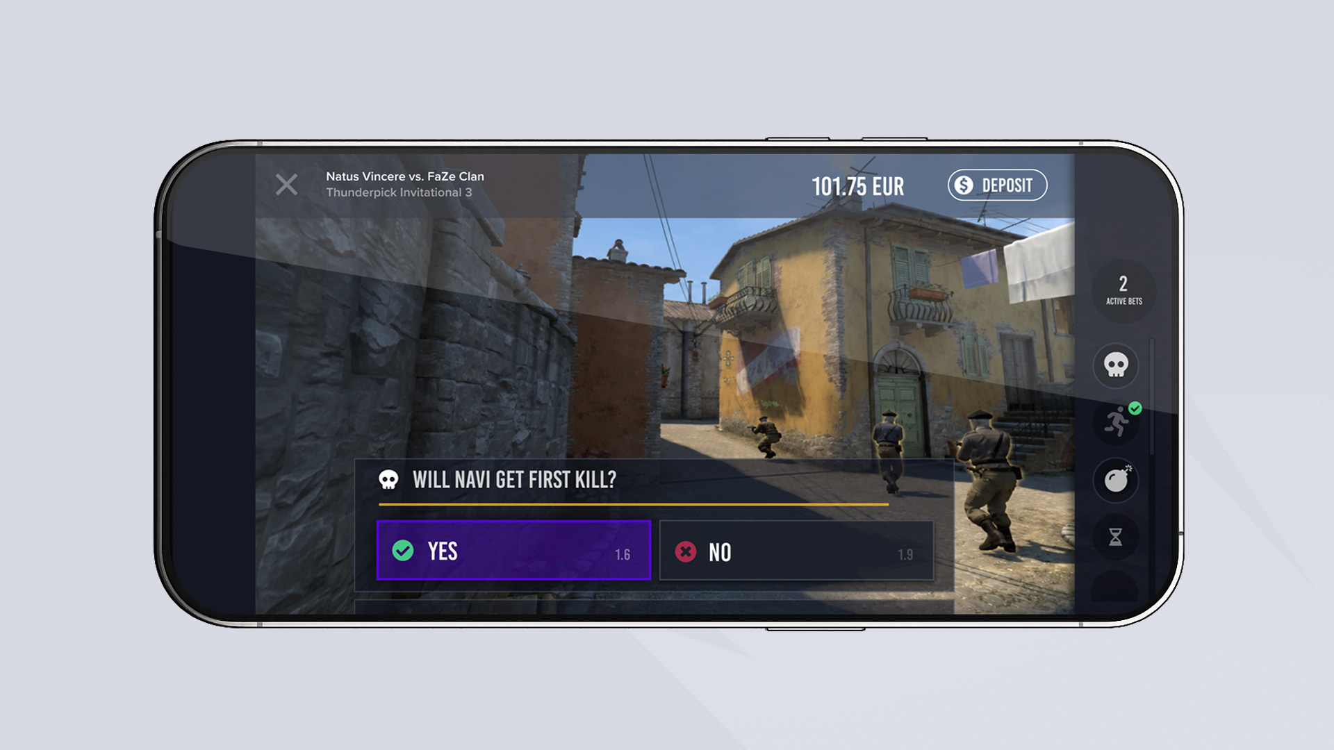
AI Micro-betting Platform
Designing for AI and ML systems
How to define the product vision for an AI ML-driven real-time micro-betting app - complete with integrated live streams.
Case study
Building a Betting Platform from Scratch
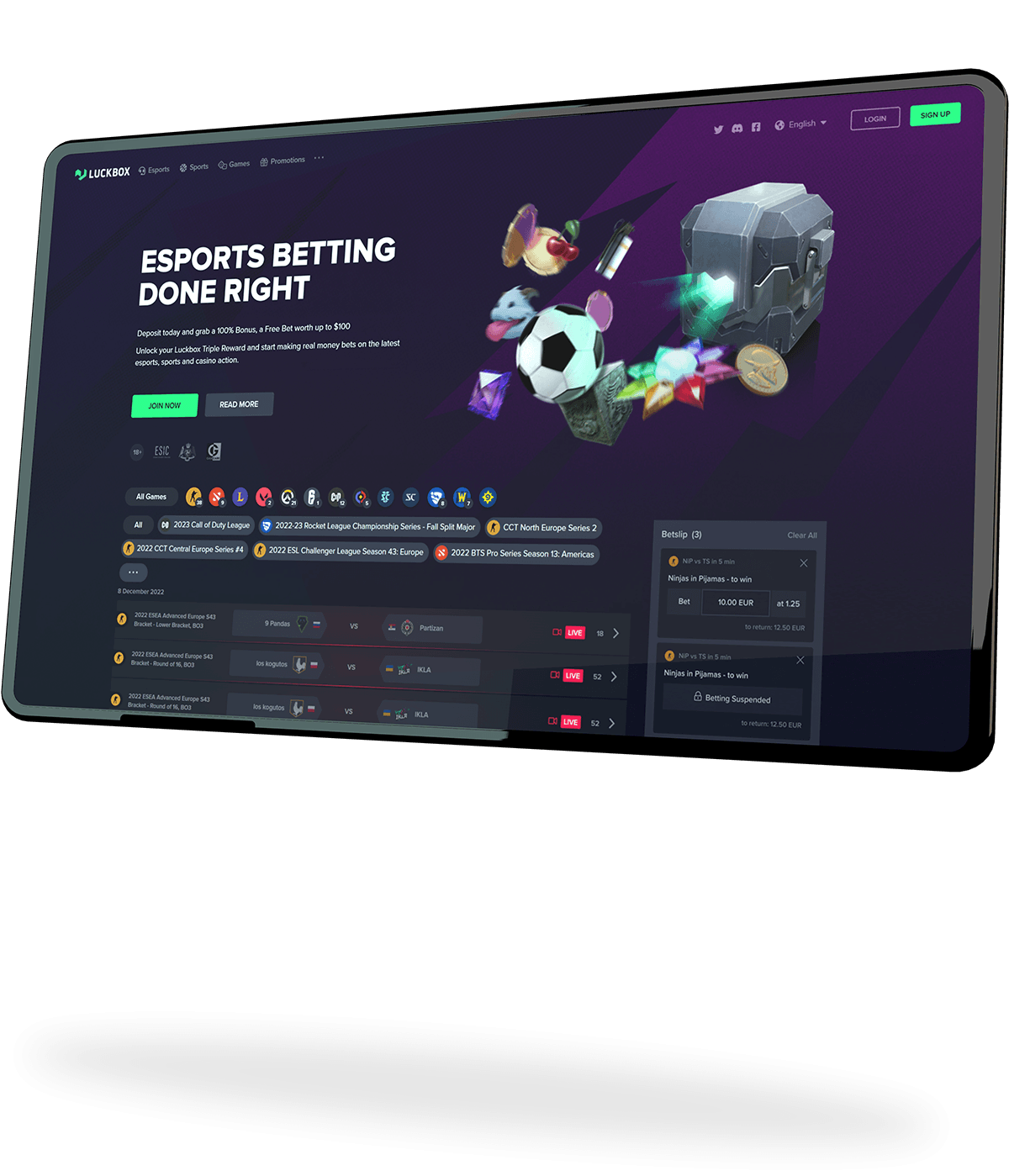
When I joined Luckbox, they had ambitious plans to become a leading destination for esports fans eager to watch, follow and bet on competitive gaming.
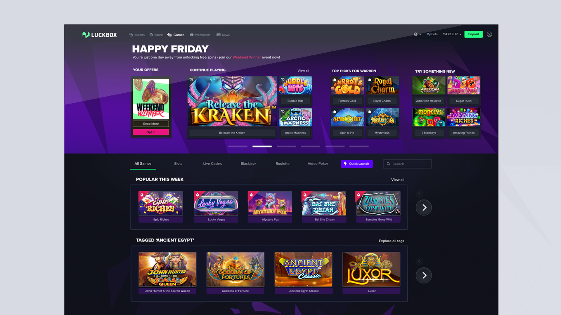
Over time, my responsibilities spanned many of the platform's most important customer touchpoints, including the homepage, onboarding journeys, account creation, mobile experiences, navigation systems and cashier flows.
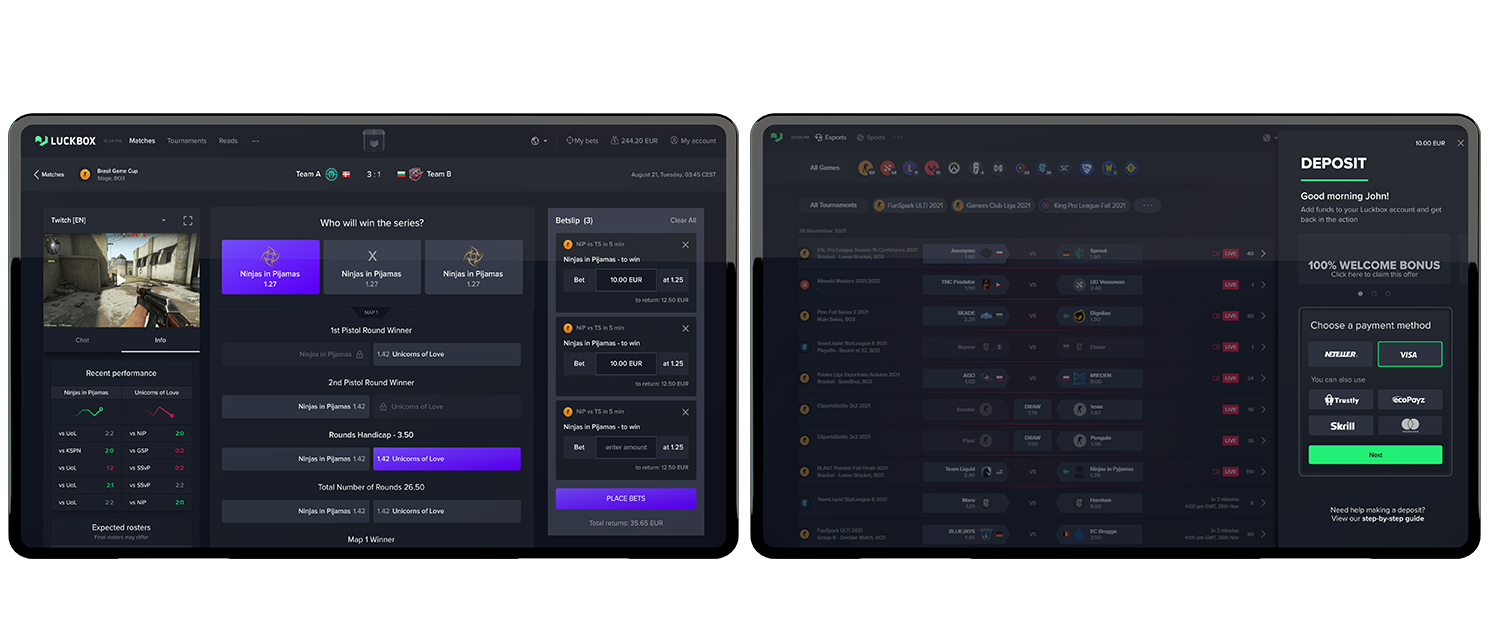
How do you create a coherent product experience for users who are new to esports betting while balancing the needs of multiple stakeholders across the business?
Looking back, the most valuable work wasn't designing any individual page. It was creating a shared understanding of what our users needed and ensuring those needs remained central throughout the design process.
Critical user interfaces were rapidly iterated after foundational work was complete
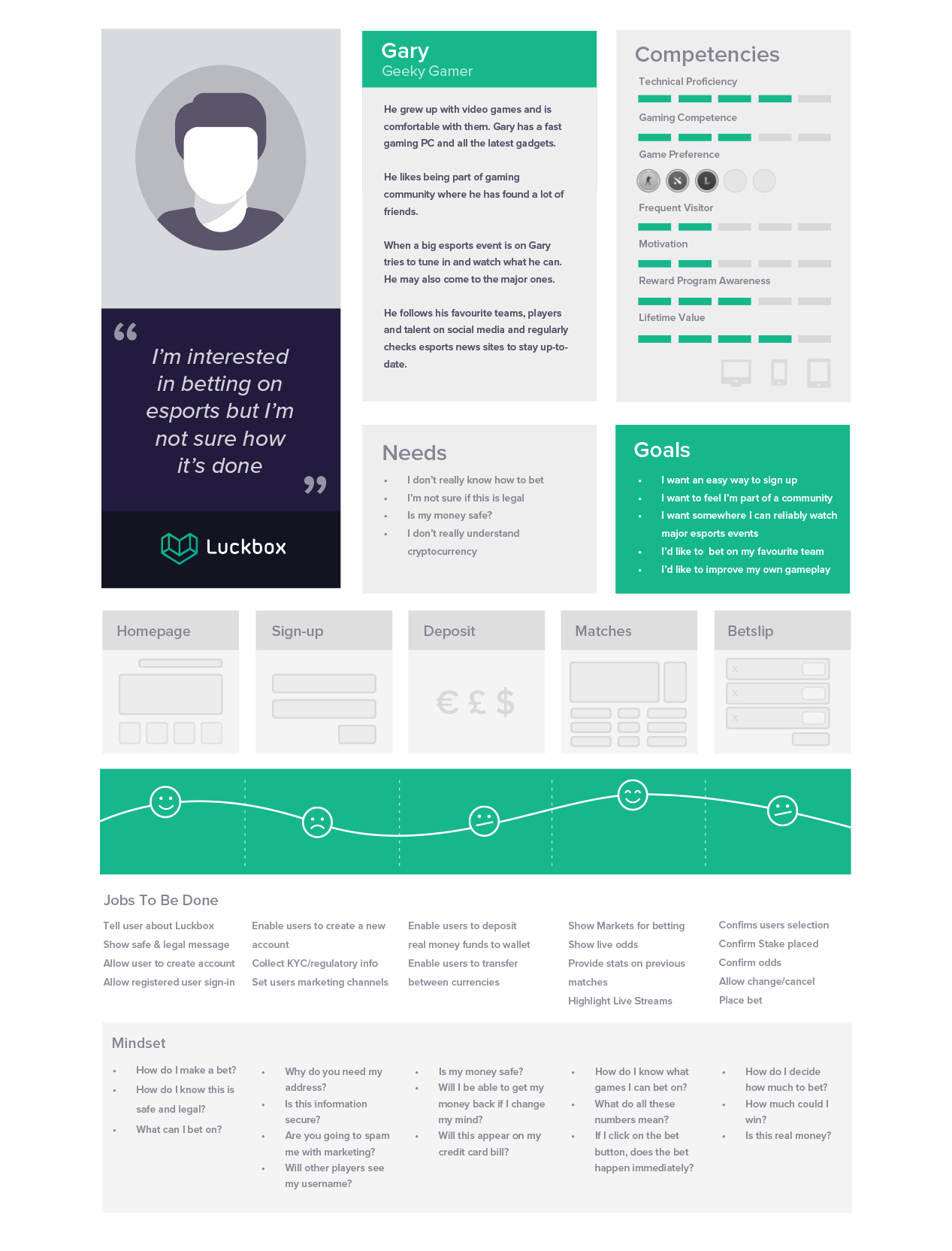
One of the first initiatives I undertook at Luckbox was creating a set of user personas that accurately reflected our target audience.
Working closely with Marketing and other stakeholders, we developed four primary personas representing our key customer groups.
The objective wasn't simply to create personas for the sake of documentation.
The objective was to establish a shared understanding of the people we were designing for.
For each persona, I mapped:
These insights were then translated into a set of user needs.
For example, several personas expressed uncertainty around the legitimacy and legality of esports betting.
Rather than recording this simply as an observation, it was translated into a product objective:
This process was repeated across all personas until a complete set of user needs had been established.
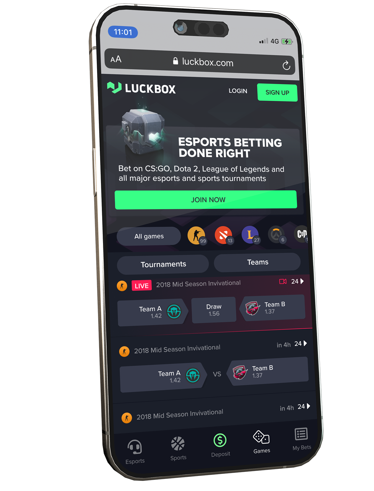
One of the challenges of designing high-visibility product surfaces is that many parts of the business feel invested in the outcome.
The homepage was a good example of this.
As the primary entry point into the platform, it sat at the intersection of multiple priorities:
The challenge was ensuring that design decisions remained grounded in user needs rather than individual preferences.
To achieve this, I created a User Needs Framework which mapped common needs and prioritised them according to importance.
The framework was then presented to stakeholders and formally agreed before any design work began.
This alignment became an important foundation for the project.
Instead of debating whether design ideas were personally appealing, conversations could focus on a more constructive question:
Does this solution address the user needs we collectively agreed were important?
This simple shift helped create alignment across the business while keeping the design process focused on customer outcomes.
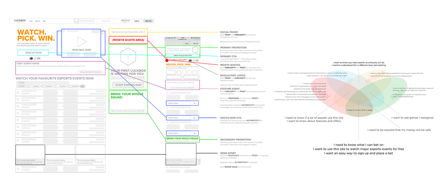
User research and user needs were used to create an agreed set of objectives for launch
“Instead of debating whether individual designs were subjectively appealing, conversations could focus on a more constructive question: Does this solution address the user needs we collectively agreed upon? ”
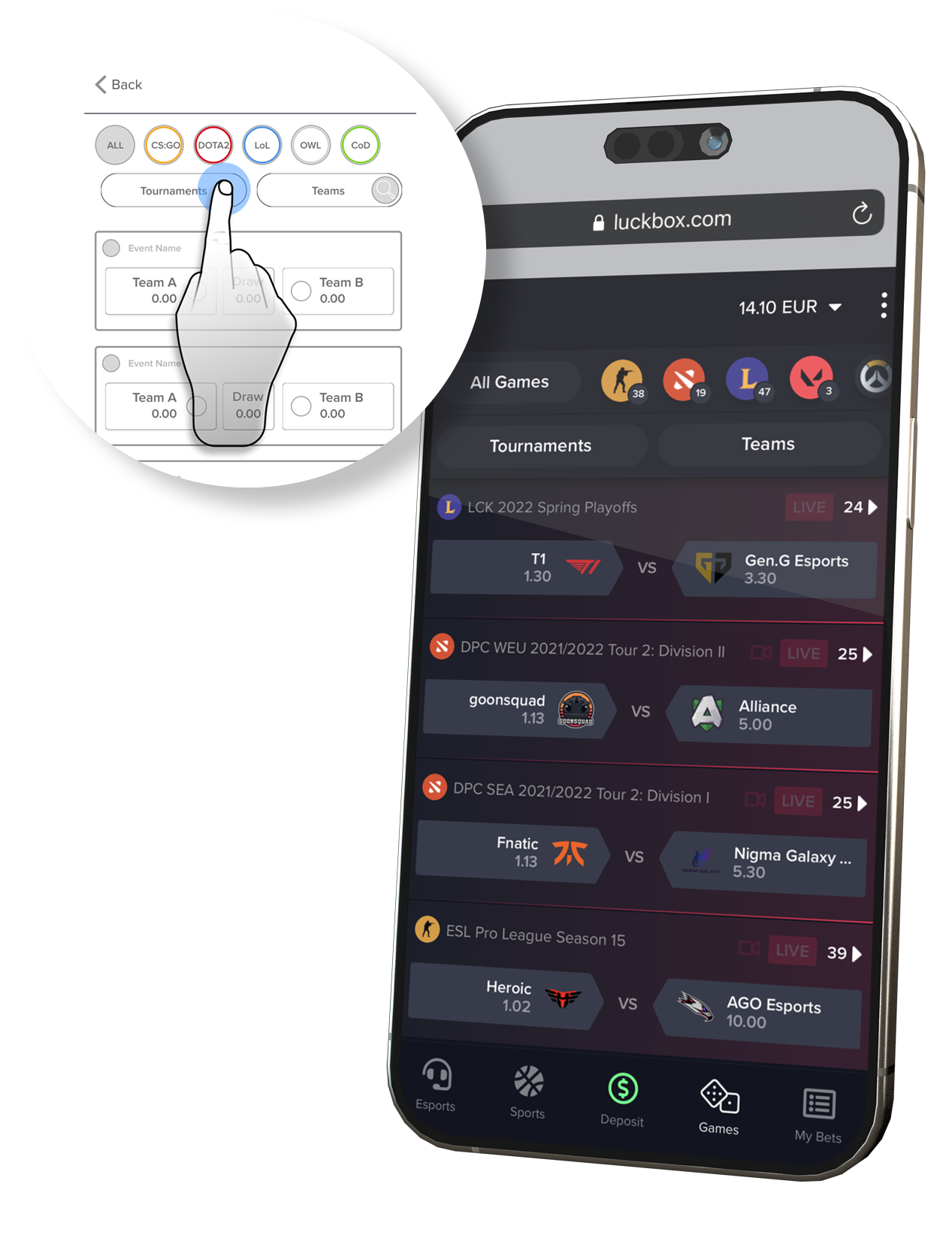
One area where these principles became particularly important was mobile design.
Esports betting platforms present users with a significant amount of information.
At any given moment users may be:
The challenge was delivering this functionality without overwhelming users on smaller screens. Rather than attempting to surface everything simultaneously, I adopted a philosophy of functional minimalism. Key principles included:
This approach allowed us to retain rich functionality while maintaining clarity and ease.
Once the objectives had been established, they became the foundation for multiple product initiatives across the platform.
The homepage was one of the most visible outputs of this work, but the same principles informed a much broader set of experiences.
These included:
Although these experiences served different functions, they were all designed around the same core objective: helping users move confidently through the product while minimising friction and uncertainty.
This consistency helped create a more coherent experience regardless of where users entered the platform or which device they were using.
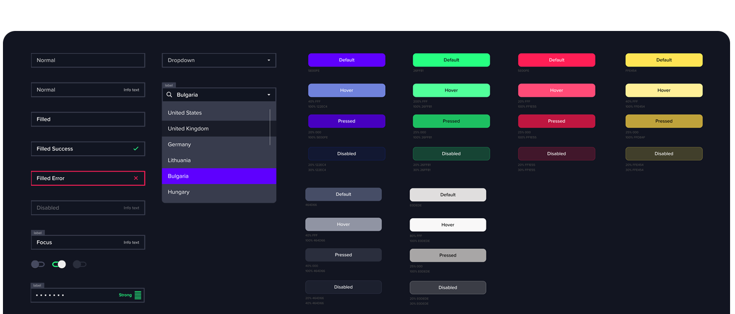
A UI Kit of fundamental elements and primitives gave the product a consistent appearance at launch
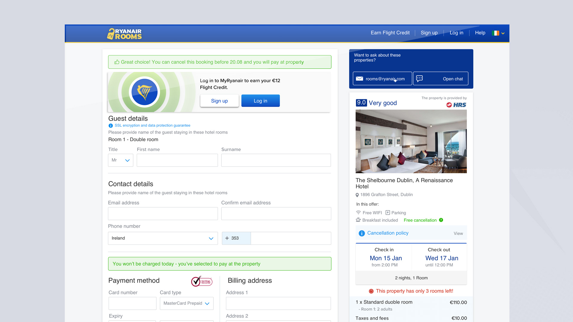
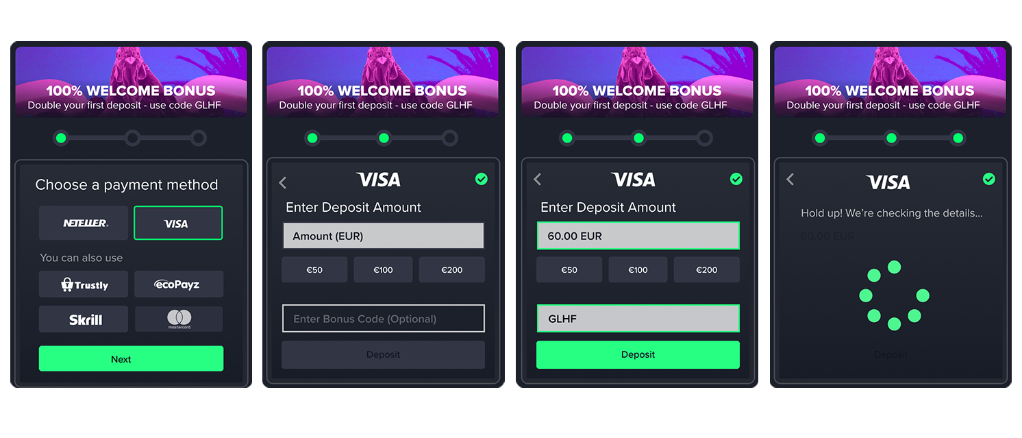
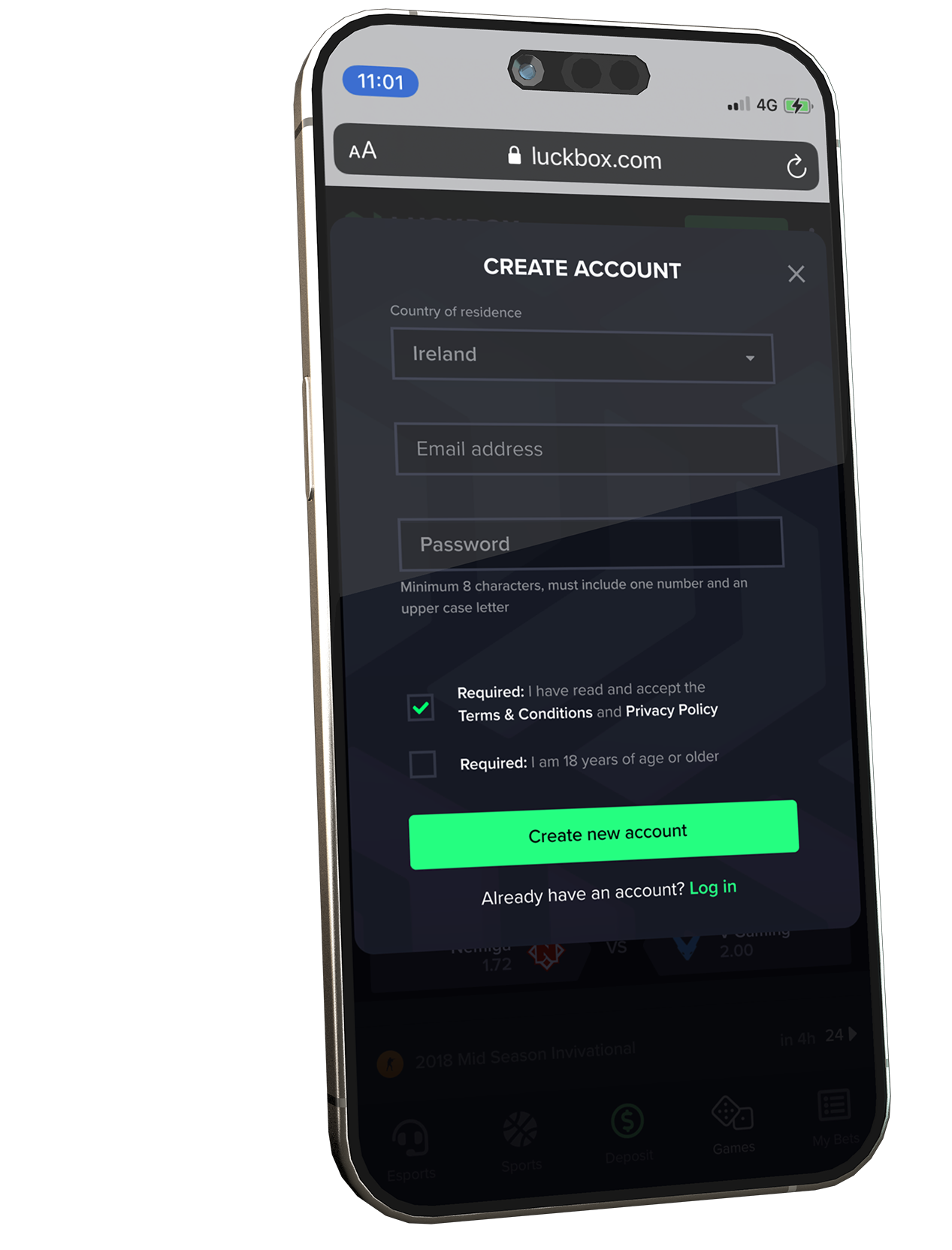
Some of the most important work occurred within onboarding, account creation and cashier experiences.
These journeys often represent the highest-friction points within any betting product.
Users are required to:
The design challenge wasn't simply making these flows attractive, it was making them understandable.
Throughout these journeys, I focused on reducing perceived complexity through clear hierarchy, visual chunking and progressive disclosure. By breaking larger tasks into smaller, more digestible steps, users could focus on a single objective at a time rather than confronting the full complexity of the process all at once.
As designs moved into development, usability testing played an important role in validating assumptions and identifying areas for improvement.
Testing sessions were conducted using remote screen sharing and moderated "think aloud" exercises, allowing participants to explain their thought processes while interacting with the product.
These sessions provided valuable insight into:
Feedback from these sessions informed a series of refinements prior to launch and helped ensure that product decisions remained grounded in observed behaviour rather than internal assumptions.

As highly complex features were added, the design kit grew to support additional UI styling
Other projects from the portfolio