AI Micro-betting Platform
Designing for AI and ML systems
How to define the product vision for an AI ML-driven real-time micro-betting app - complete with integrated live streams.
Case study
When the obvious problem wasn't the actual problem
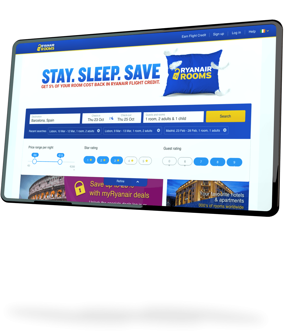
In October 2016, Ryanair launched an accommodation platform, 'Ryanair Rooms'.
The business case appeared compelling. Accommodation bookings represented a natural extension of the travel journey, the operational overheads were relatively low and the introduction of a cashback programme called created an additional incentive for customers to book through the platform.
On paper, the opportunity seemed straightforward. In practice, it wasn't.
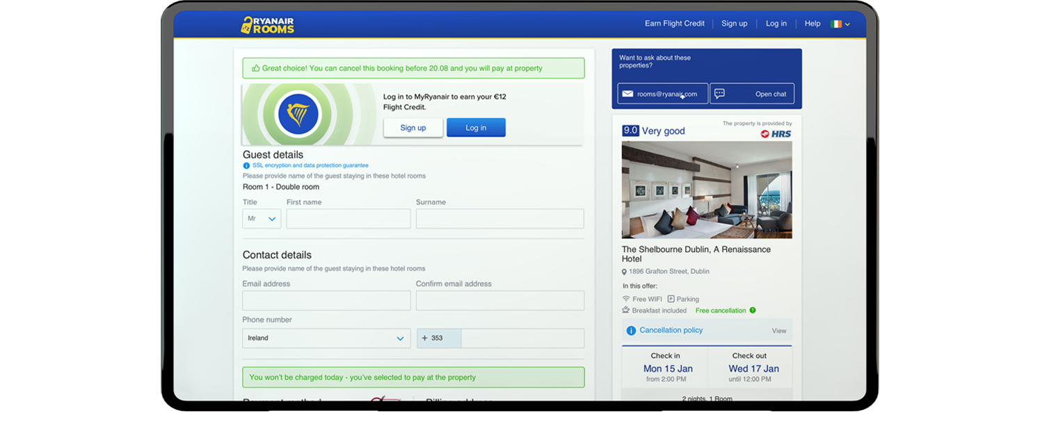
The redesigned Checkout page showing added assurance messaging
By early 2018, the Ryanir Rooms product was significantly underperforming expectations. Conversion rates were disappointing and pressure was mounting to improve results.
I was called into a meeting alongside other senior members of the Design team.
The brief was simple: Fix Ryanair Rooms.
The assumption from Marketing was equally simple - the website wasn't converting because the design wasn't good enough. The expectation was that we would begin redesigning the product immediately.
My instinct was that the problem ran deeper.
At first glance, the request seemed reasonable.
When a product struggles to convert, redesigning the experience is often the first response.
However, the scale of the performance issues suggested something more fundamental might be happening.
Rather than jumping directly into solutions, I worked closely with our UX Research team to better understand what customers actually thought about the product.
Together we conducted a large-scale research programme that combined:
Over several days we analysed hundreds of customer responses, reviewed behavioural patterns and interviewed users directly about their experience with Ryanair Rooms.
The findings were revealing.
The issue wasn't that customers couldn't use the product - the real issue was trust.

One of the most surprising discoveries was how consistently the same concerns appeared across interviews.
Customers weren't evaluating Ryanair Rooms as an accommodation platform - they were evaluating it through the lens of the Ryanair brand.
Years of association with low-cost flights had created assumptions that customers were carrying directly into the accommodation experience.
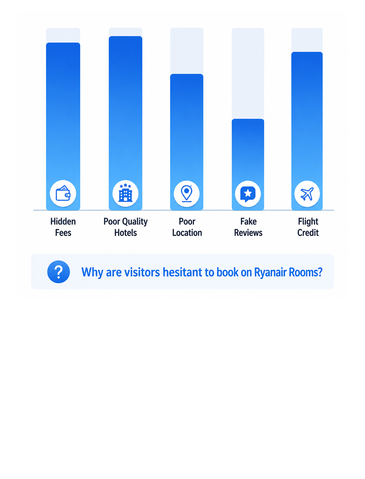
Common concerns included:
These concerns weren't being created by the interface itself.
They existed before customers had even started their journey.
The challenge became clear - if we wanted to improve conversion, we first needed to reduce anxiety.
“These concerns weren't being created by the interface itself. They existed before customers had even started their journey.”
The research fundamentally changed the direction of the project.
Instead of pursuing a broad visual redesign, we developed a much more focused objective:
Introduce trust and reassurance at every critical decision point throughout the customer journey.
Rather than treating trust as a single feature or message, we approached it as a system-wide experience.
Every major customer concern was mapped to a specific intervention.
Hidden Fees & Cancellation Policies
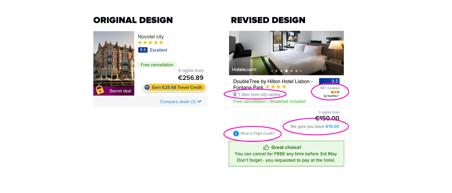
Research revealed that users delayed booking because they anticipated hidden fees and restrictive cancellation terms.
To reduce uncertainty, pricing breakdowns, cancellation policies, and clear "FREE means FREE" messaging were surfaced earlier in the journey.
Accommodation Quality & Location
Many users assumed Ryanair Rooms only offered budget airport hotels, limiting consideration of higher-quality properties.
Listings were redesigned to emphasise property imagery, hotel quality, city-centre proximity, and third-party provider branding to broaden perceptions of the inventory.
Trustworthy Reviews & Descriptions
Users were sceptical of hotel ratings and questioned their independence.
To build trust, review-provider branding, review volumes, data-source transparency, and customer recommendations were made more prominent throughout the experience.
Explaining Flight Credit
Despite being a key product benefit, Flight Credit was poorly understood by customers.
Messaging was revised to clearly explain its value, earning mechanics, and redemption process at key decision points, improving comprehension and relevance.
Rather than delivering a single large redesign, we introduced changes incrementally.
This allowed us to monitor behavioural shifts and conversion improvements in real time.
Over a period of weeks, trust and reassurance messaging was strengthened across the platform through:
Almost immediately, we began to observe measurable changes in customer behaviour and improvements throughout the conversion funnel.

Other projects from the portfolio