Brief: Create a new design for the Full Tilt website to be consistent with new brand aesthetic and to increase conversion/retention rates and SEO efficiency while decreasing bounce rate.
Full Tilt Poker was the world's second largest online poker site, with over 23 million registered users and in excess of 1.2 million homepage visitors per month.
In July 2014, Full Tilt went through a rebrand exercise which required a redesign of the homepage design.
As Head of Design & Brand Services, I led the team behind the creation of our new design and worked alongside development teams and product managers to successful implementation of the new design.
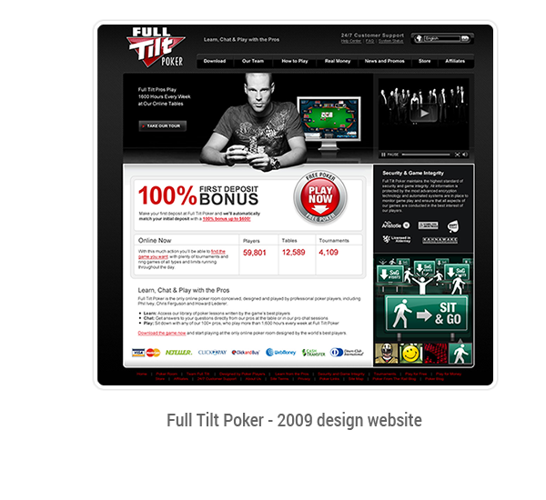
I had been part of the team that designed the previous homepage in 2008. Over the years, the following problems had become evident:
From a purely aesthetic point of view, the site was looking very dated:
The process for creating the final design was based on the classic "build, learn, measure" iterative loop on which our User-Centred Design processes were based.
Using the existing homepage as a reference, we entered into a requirements-gathering phase. This included a review of existing analytics and interviews with key stakeholders across the company (marketing leaders, business intelligence teams, SEO team) and web development & web publishing teams.
Following several rounds of consultation with stakeholders, we devised an overall strategy for the design that prioritised Conversion (i.e. product download and new account creation), Promotions and special offers, User on-boarding and Cross-vertical awareness.
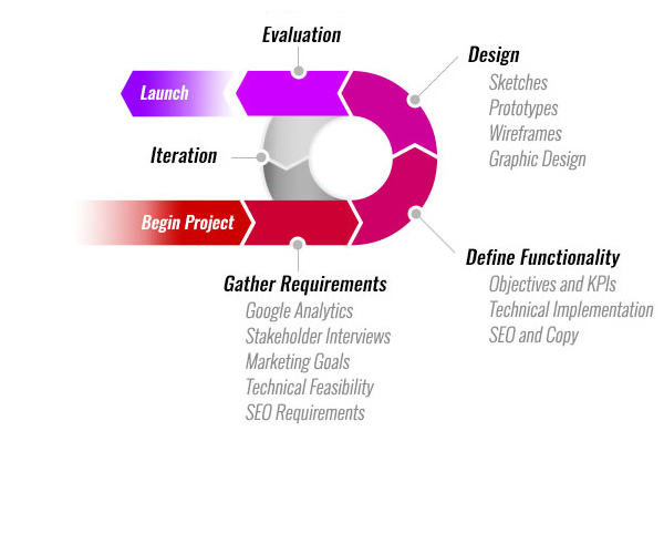
Armed with the results of our stakeholder interviews and analytical data, we began the iterative process of creating layouts, prototypes and wireframes.
These were presented to stakeholders for feedback and gradually passed through higher-fidelity iterations until a final wireframe was signed off.
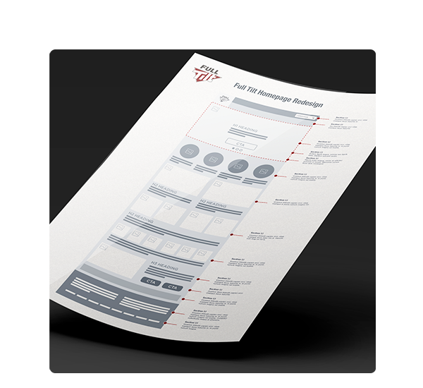
As we moved on to the graphic design phase of the project, we began to notice some weaknesses in the page design.
The final approved copy was heavily driven by SEO requirements. As a result, it was very rich in SEO value, but very uninformative for actual users.
The hierarchy of the page was such that we had lots of elements of equal priority, leading to a design that tended to look messy and unstructured.
As a result, the layout resulted in a page that was long, but was filled with largely uninteresting content and which lacked a natural focal point.
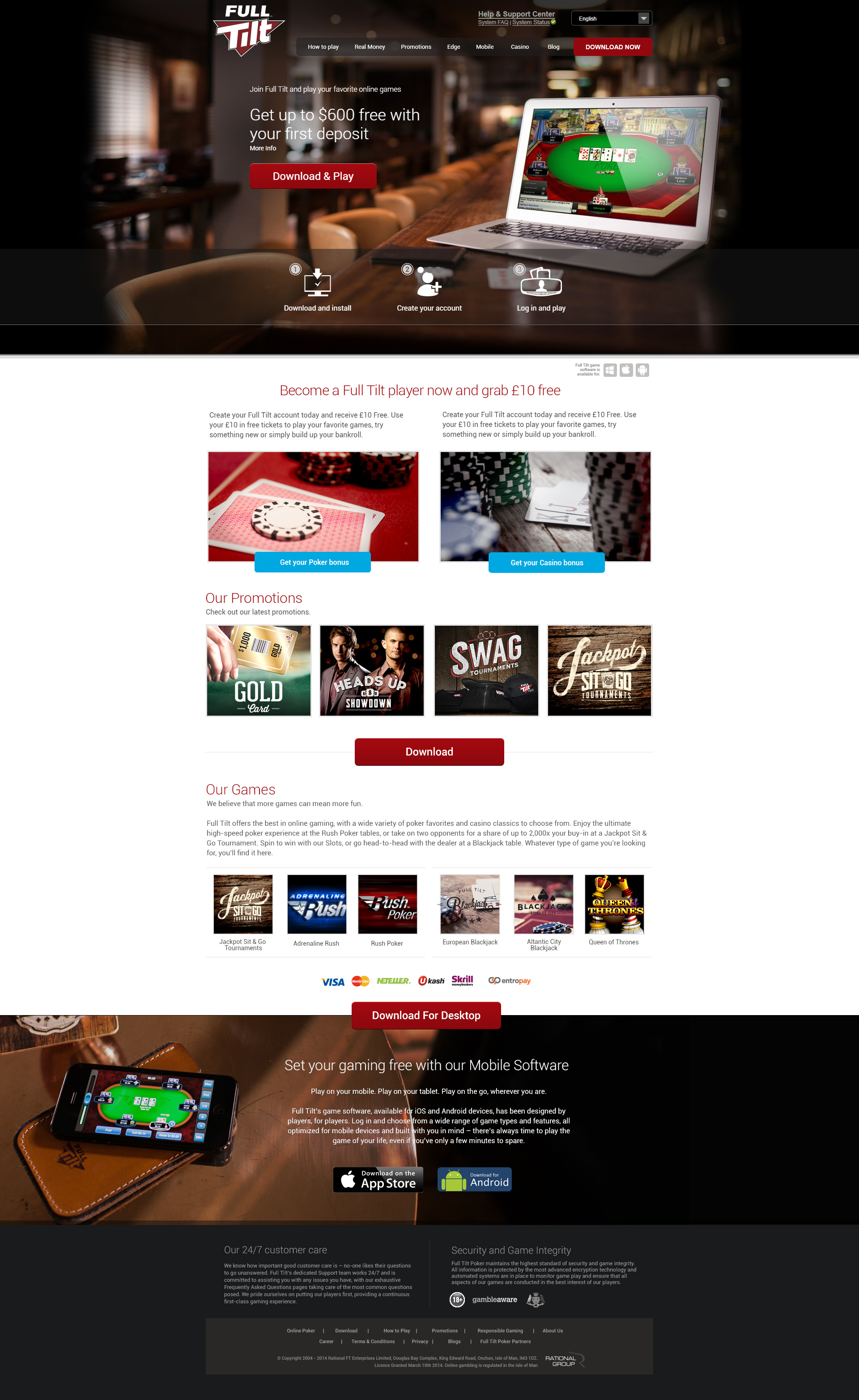
In the months following launch, our analytics team gathered statistical information on the performance of the new design.
While traffic to the page remained consistent, conversion rates increased by 26.2% and bounce rates decreased by 15.3%.
Heat maps and scroll maps created with Hotjar supported the decisions made during the graphic design phase - users were focusing their attention on the image heavy area at the top of the page (specifically the Download button) and very few users were scrolling down the page. Those that did scroll were clicking on download buttons further down the page.