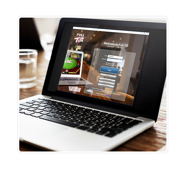
For users of any online poker software, the most crucial part of the game experience journey is the Game Lobby. From here, players need to quickly find games that meet their specific requirements of game type, buy-in level and limit-type. When it was launched, Full Tilt Poker offered a modest selection of poker games. The game lobby gave a full list of every game available, which users could filter by clicking on a row of game type buttons. Due to the incredible growth of the company, the user interface was quickly overloaded with filter buttons and secondary navigation. A complete overhaul was needed.
The first step in this project was to analyse the underlying information, and identify the underlying cause of the architectural mess. In cooperation with Product Analysts, my team performed an audit of our game offerings and looked for logical ways to categorise the information.
During a card sorting exercise, we identified the structure and hierarchy behind the content, and devised an information flow which would - theoretically at least - allow us to categorise our games and future-proof our product for increased scale and breadth of offering.
The challenge now was to create UI which made it intuitive for users to follow this information flow.
Several rounds of intense prototyping followed, using everything from pen and paper, to Flash-based interactive prototypes. In consultation with Marketing leaders and IT department, we identified the business requirements and technical limitations of the project.

As we progressed, we developed a UI that was intuitive for users with poker knowledge and which met the requirements of the business. However, it was a struggle for us to find a single solution that served the needs of power-users, while still appealing to new users. We made the difficult decision to proceed with two separate interfaces: one 'basic view' which simplified the on-boarding process for new users, and one 'advanced view' which provided power-users with powerful filters to find their ideal game.
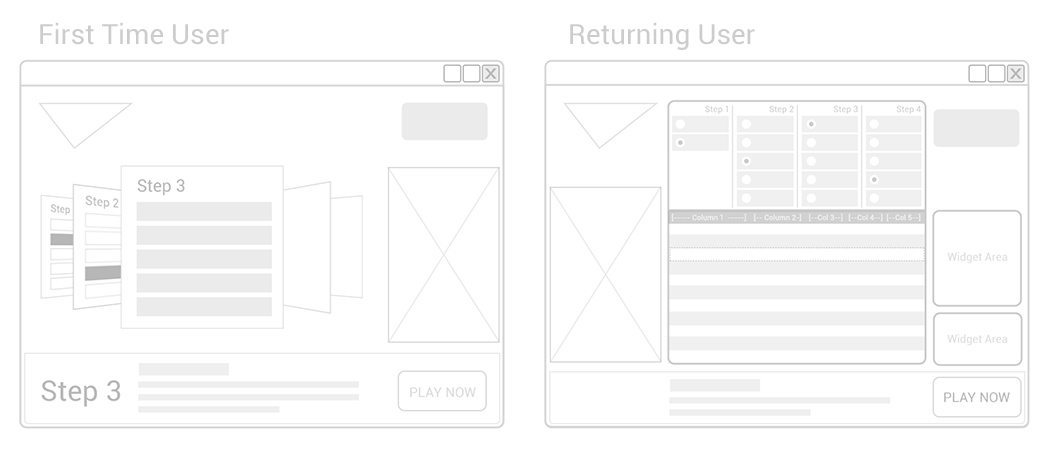
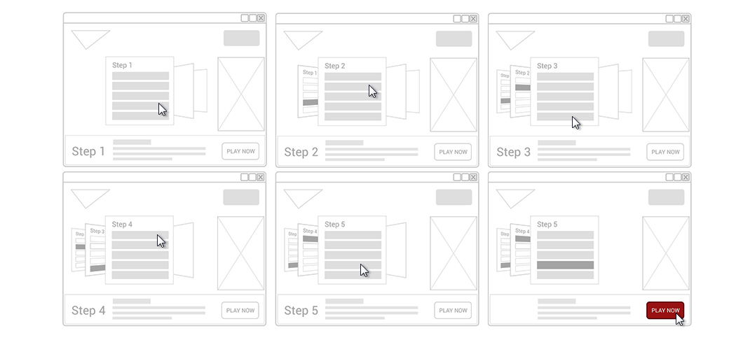
During prototyping, we found that many users had developed an intuition for 'carousel' type navigation, which had become prominent on ipod devices. The carousel solution allowed us to break the user journey into a step-by-step presentation, and gave an extremely contemporary feel to the interface. Gradually, the technical challenges of this solution became obvious and the lobby was refined to a simplified 'step-by-step' view.
Once the decision was made to create two distinct interfaces, we embraced the opportunity to add 'power functionality' to the advanced view, including 'favourite list' functionality and custom widgets to allow users to tailor the UI to meet their individual preferences.
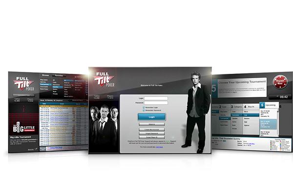
Once final wireframes were approved by all stakeholders, my team moved to solve the aesthetic challenges of the project. Working to brand guides and following the lead of our television programming and other marketing, we created a style guide which allowed us to create a consistent aesthetic across both basic view and standard view and used a distinctive colour palette of black and red, with bright blue colours used as an interaction colour.
Following an intense period of software development, the redesigned interfaces were launched to acclaim from poker players and media. The simplicity of the 'basic view' interface allowed Full Tilt Poker to attract a casual poker audience, and the scalability of the interface allowed Full Tilt Poker to become pioneers of new game formats, including the revolutionary fast-fold format, Rush Poker.