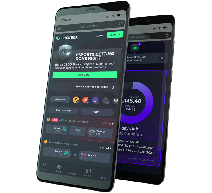
Brief: The Luckbox apps are designed to allow esports enthusiasts to read gaming news, watch live streams and bet on their favourite esports events.
As Director of Product at Luckbox I had full responsibility for leading the research and testing, as well as all wireframing and prototyping.
This Case Study provides an overview of the key decisions behind the successful design of these apps.
Keeping it simple while staying feature-rich
From a product point of view, we wanted our mobile users to enjoy access to the same great features across all platforms, however we understood that the needs of a user on the go are different to a user on their desktop.
The first task in designing our mobile apps was to define what features were required to give users a rich user experience that delivered all the functionality they enjoyed but could be streamlined to give optimal experience on the small screen.
Game Selection and Curation
At any time of day or night, there are hundreds of esports events underway. We tailored our tournament filtering and team-search features to deliver an uncompromised mobile experience. Finding a game, researching player stats, predicting the outcome and watching the action unfold on a mobile device has never been easier.
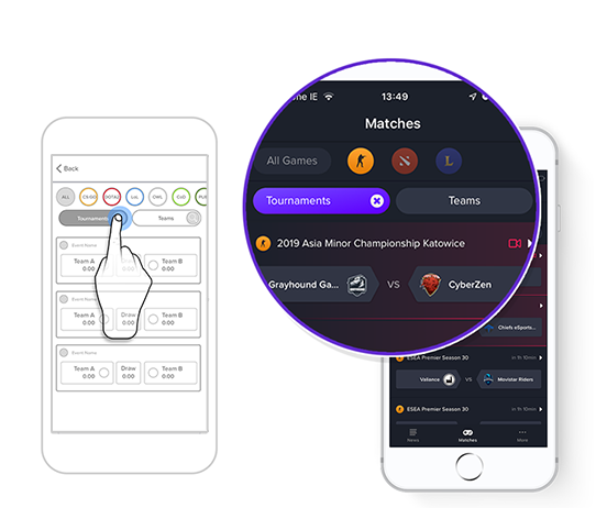
Game Filtering
Good mobile design is about minimising user input. For our mobile apps that means no cluttered screens, no groups of complicated filters, and no endless swiping through screens — just two taps and mobile users can find the match they want.
Driving Engagement
While it may seem counter-intuitive, ‘clean’ design is proven to drive higher user engagement, improve usability, and promote brand affinity and product loyalty. We embraced ‘functional minimalism’ to help us deal with the risk of a cluttered interface.
I implemented 3 key UX rules:
- Keep content to a minimum
- Keep interface elements to a minimum
- Use progressive disclosure where needed
Familiar navigation
We used a style of icon driven navigation which is already familiar for users. This style of navigation is exceptionally intuitive and ensures that the key functionality of the app is always just a tap away. In contrast with many ‘burger menu’ interfaces — which often hide key features away from the user — the Luckbox navigation is exposed and provides notifications when new information is available.
Focus on content
Our navigation is implemented in a way that allows users to focus on the main content of the app without becoming distracted by the navigation.

Let users know where they are
A good interface minimises cognitive load by providing clear information about the user's place within the app. Users always know where they are, and always know how to get where they want go.
Pattern Library and design consistency
Throughout the app design, we have carefully enforced a pattern library. This library of button styles, colour coding and interactions helps users understand how to navigate easily through an app, and to anticipate the consequences of any action they take.
A clear path
The Luckbox interface guides our app users through our site in a logical way, walking them through onboarding and account creation processes, through to match pages, streams and easy-to-understand betslip functionality.
The Luckbox interface focuses on clean design and high contrast text to help users engage with our platform.
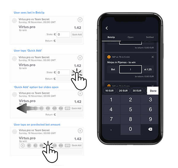
Bite-sized tasks
To help users understand and interact with our apps we designed our key flows as ‘bite size’ chunks. This ‘visual chunking’ reduces the perceived complexity of important interactions such as Account Creation, bet selection and deposit flows so that users can focus on one clearly defined task at a time. Multiple user-testing studies have repeatedly shown that players are more likely to complete tasks when the objective is presented as smaller sub-tasks.
Designing for fingers and not for cursors
While esports enthusiasts may spend hours each day honing pixel-perfect accuracy with their 4000 dpi gaming mouse, the reality is that users are not always quite so accurate when it comes to using their phones. Mitigating against the phenomenon of “fat fingers” — more politely referred to as ‘user input error’ — was one of my key tasks.
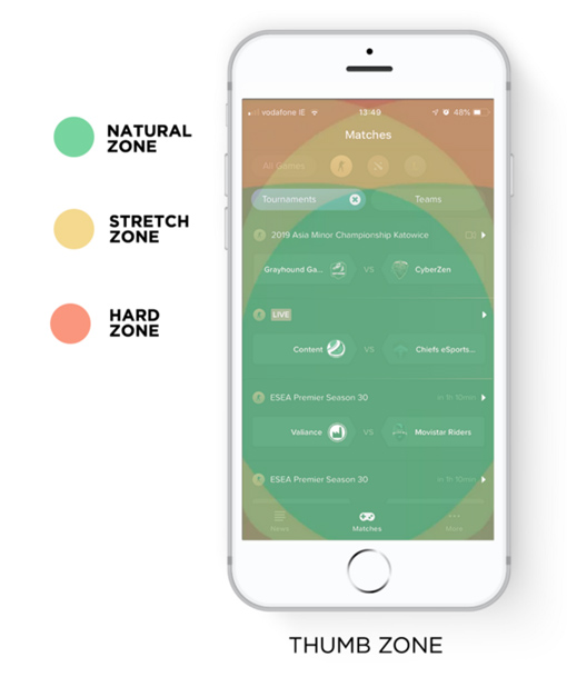
Designing for user input isn’t just about making large targets and interactions though — it’s also about considering the way users hold their devices.
Though there are multiple recognised ways that users hold their phone (including ‘one-handed’, ‘two-handed’, ‘cradled’ and ‘hold and touch’), the outcome is that commonly used interactions should be placed in areas of the screen that most users can “naturally” reach. Less common interactions can be located in less accessible areas known as “stretch zones”, and rarely-used interactions (or interactions which significantly affect user flows) are located in “hard to reach” zones.
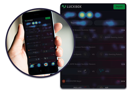
The launch of the apps and mobile website in April 2019 confirmed our assumptions. Users were using the Luckbox platform across several devices. Heat maps and analytics confirmed that users were engaging with our filtering tools as intended and error input across crucial onboarding flows was minimal.
I conducted an analysis of engagement data and made a series of post-release recommendations to improve usability and interactivity. These recommendations were implemented and resulted in some performance improvements.