Full Tilt Poker were pioneers of mobile poker gaming, launching the very first real money poker app in the "Android Market" in 2010. However, by 2013 Full Tilt had fallen behind their competitors and needed a completely redesigned poker app to make up ground.
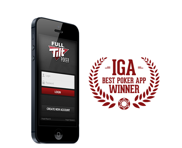
Working alongside product managers, developers and designers, I led the UI/UX and graphic design of the Full Tilt Poker app which won the IGA Best Poker App Award in 2014.
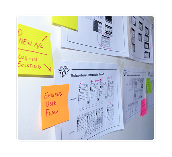
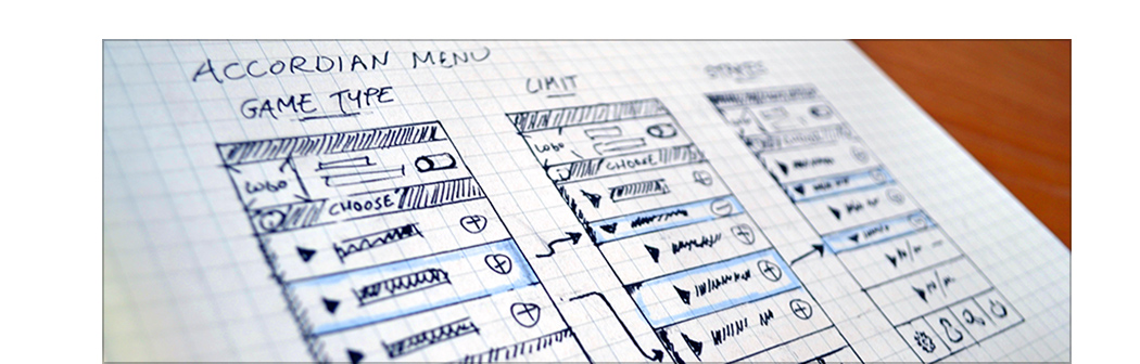
We were initially encouraged to design the product on a screen-by-screen basis (i.e. start by designing a complete log-in screen, then move forwards to the next screen, identifying new functionality as we progressed).
However, I advocated a more holistic approach to the problem: we started by plotting the 'spine' of the product - the core user path from log-in screen to gameplay - and then we mapped all other functionality as secondary flows which would 'hang' from the spine.
This approach allowed us to iterate gradually across the entire project without getting bogged down in highly-granular UI discussions and gave us an overview of a project that had initially seemed intimidating. It would let the functionality evolve more naturally, and - as the project progressed - it allowed teams to work in parallel across several user flows.
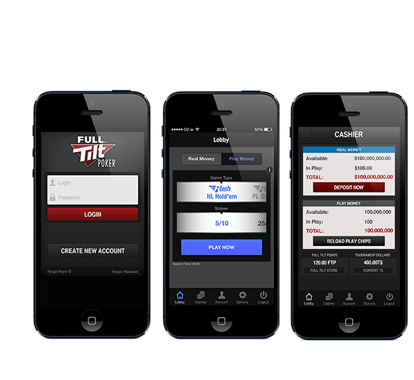
From the outset, I gave the design team a "Two Tap Rule". Although we were yet to define the UI, I told the designers that it MUST be possible for a logged in user to get from a game selection screen to poker gameplay in just two taps (or swipes, pinches or other gestures). This top level aspiration was key in driving us towards a graceful, usable interface.
Building around our core user flow, we gradually added secondary flows for Account Management, Game Options and Cashier functionality. Although these were initially added to a 'burger-style' menu, we moved to a traditional footer menu after a few rounds of testing with interactive prototypes on iOS devices.
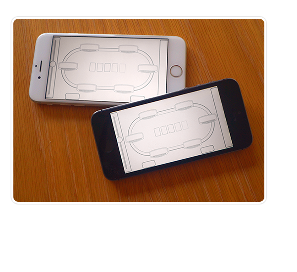
To reduce development and QA timeframes, we based the gameplay screens on the layout of our existing desktop software, using a top-down "racetrack" style view, and based on existing player "pods" and avatars. This reinforced the feeling that Full Tilt's mobile app was simply an alternative viewport into our poker games; players on mobile devices and players on desktop platforms were not in distinct player-pools, they were competing against each other.
However, there was one area of gameplay where we deviated from the desktop; the betting mechanics were optimised for a mobile experience.
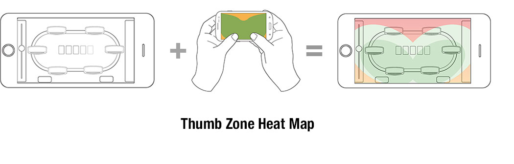
Using interactive prototypes, user-testing and thumb-zone heat maps, we identified the optimal positioning of our gaming interface for a two-handed grip. In addition - and after several iterations - we devised a unique 'thumb-slider' betting mechanism which allowed players to increase their betting amounts by swiping on the side of the screen. This gave the app a distinctly mobile functionality that highlighted that the game had been designed with smartphone functionality in mind.
The launch of the app in both iOS and Google Play Store was followed by an intense promotional campaign and within a few weeks the mobile apps were accounting for almost 50% of all account signups and almost 30% of revenue.
As a further acknowledgement of our achievement, Full Tilt's mobile app received the International Gaming Award for Best Mobile App in 2014.