For almost 10 years, Full Tilt focused exclusively on poker gaming, which was accessible either through the desktop software or mobile apps. A business decision to expand our games catalogue to include new verticals (casino table games and slots gaming) led us to reconsider our players needs.
While poker players are familiar with the convention of installing software on their desktop computers, the paradigm in casino and slots gaming is to deliver games through a web browser. It became clear that any successful move into casino and slots gaming would require a new website.
I met with department leaders from across IT to build a roadmap for the project. It quickly became obvious that in order to meet the launch schedule set by management, design would need to start immediately. In fact, design and development would have to find a way to work in parallel.
The first step, inevitably, was competitor analysis. We created moodboards which analysed the site structure, layout and aesthetic of competitor offerings. Based on this, we quickly prototyped a site map and created a top level understanding of site functionality.

Here's where it got interesting.
Conventionally, the design team would create a sitemap that clearly broke down the functionality for each page on the website. This would enable us to understand the user journey, and would enable our development teams to build web pages with the correct functionality.
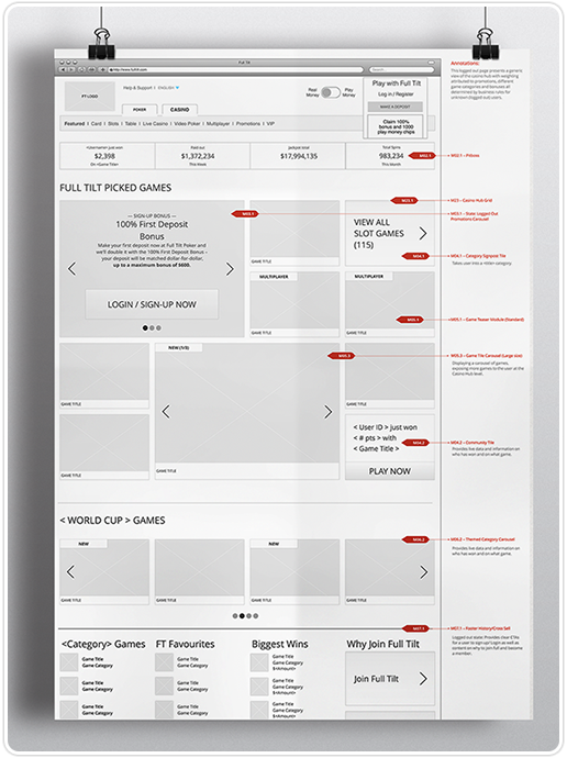
In this case, the need to work in parallel with our development team required some innovative thinking. So, instead of taking a conventional page-by-page design approach, we created a 'functional map' of the website. We identified specific modules (e.g. a 'game state module', a 'game teaser' module, a 'user balance' module, a 'game filter' module). For now it didn't matter what page each module appeared on - by creating functional wireframes of each module we freed up development resources to build the underlying code.
As we began to assign each functional module to specific pages, we began to create wireframes in a more conventional manner. However, the wireframes were still only a functional depiction of each page -- they didn't even begin to describe the structure or aesthetic of the website.

In parallel, we began the graphic design of the site. Moodboards were created exploring a number of possible directions for the site and - working with marketing leadership - we proposed that we should avoid the conventional approach to casino websites (cluttered designs, garish colour schemes and 'Vegas' aesthetics) and create a casino that was in line with our brand.

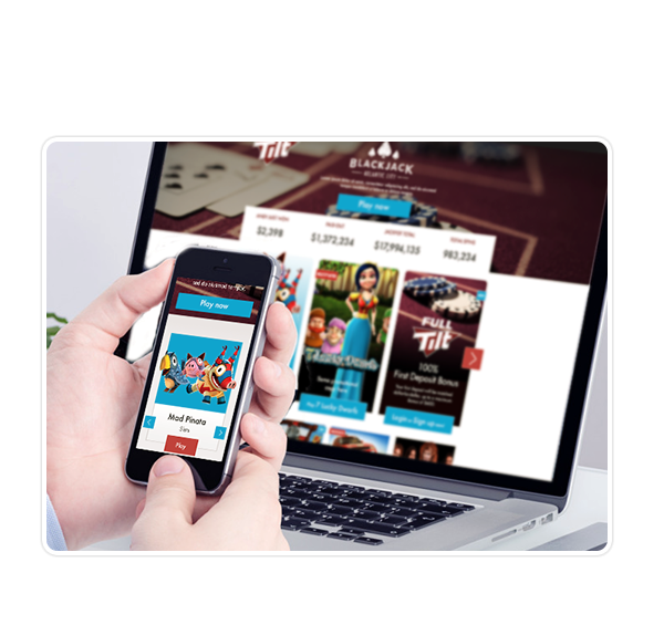
Having created a functional wireframe and having identified an aesthetic, the design team began exploring ways in which the functionality of the website could be executed creatively. After several rounds of design, wireframes and prototypes, we zeroed in on a style that was bright and colourful without feeling cluttered or chaotic. In contrast to the conventional approach, our design had a strong hierarchy, and we adapted a clean, "flat" style across the UI elements, which gave the site a user-friendly aesthetic.

Just as we were completing the design of the site, our development team were completing the back-end implementation.
As a result, both the design and functionality of the site arrived with our front-end developers at the same time.
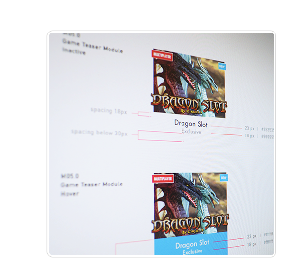
As well as detailed Photoshop documents, we delivered a suite of completed assets accompanied by style guides and technical handover documents which detailed hex colour values, margins, padding and other specifications.